
Devia UK Leaflet Design
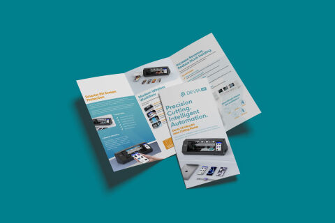
This portfolio showcase highlights the commercial print architecture and multi panel asset layout for the Devia UK Trifold leaflet design. The objective was to design a highly professional, clean, and modern promotional brochure that bridges tech industry authority with fluid marketing design, instantly communicating manufacturing precision, automated hardware reliability, and structured business communication.
Design & Requirements Breakdown
Visual Symbolism – The design features a stylised, minimalist tech emblem accompanied by the "DEVIA UK" corporate branding that crowns the upper margin of the front cover as the primary brand mark. This technological theme is echoed beautifully across the layout via clean, high resolution product photography showcases, diagrams illustrating automated workflow paths, and a dedicated multi step layout detailing the machine's seamless wireless cutting operations.
Typographic Architecture – A bold, modern sans-serif display typeface blocks out the primary headline "Precision Cutting. Intelligent Automation." directly on the front cover panel, accompanied by a smaller, vibrant orange subtitle highlighting the machine's model specifications. Across the inner panels, a lightweight sans-serif typeface maintains a highly precise alignment, balancing technical benefit bullet points, operational workflows, and key business revenue statistics to keep a lightweight information hierarchy optimised for effortless reading.
Premium Presentation – The promotional collateral is presented in a premium 3D print mock up perspective resting at an angle on a deep teal studio backdrop. This dynamic composition showcases both the fully opened tri-fold interior spread and a closed front cover panel stacked overlapping it, creating realistic depth, professional paper margins, and an authentic presentation of a complete retail marketing touch point.
Strategic Colour Choice – A sophisticated, professional palette of deep royal blue and bright cyan forms the core brand signature and typographic hierarchy, heavily contrasted by a crisp white paper canvas and a striking pop of orange for sub headlines and call to actions. This distinct, high contrast palette evokes immediate corporate trust, industrial tech logic, and a clean, recognisable wholesale hardware identity.
Target Audience Focus – The structured, product first layout is tailored to engage professional electronics retail owners looking for smart screen protection solutions, mobile repair shop managers seeking advanced on demand cutting machinery, and tech distributors demanding transparent, highly professional B2B marketing communication.