
Dan Carman Trilogy Book Covers Design
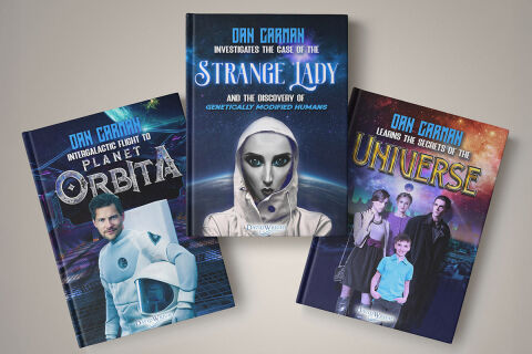
This portfolio showcase highlights the commercial series branding and unified print jacket layouts for the Dan Carman Trilogy Book Cover Designs. The objective was to design a highly cohesive, striking, and cinematic collection of book covers that bridges science-fiction, cosmic mystery, and character driven adventure, instantly communicating serial branding consistency, narrative continuity and a compelling visual universe that commands presence as a complete box set or retail trilogy on any bookstore shelf.
Design & Requirements Breakdown
Visual Symbolism – The trilogy layout features a meticulously structured progression of central visual anchors across three distinct sci-fi premises. The first cover displays a confident astronaut protagonist set against a star ship launch hangar; the central, dominant anchor features a stylised, hooded genetically modified figure looking out from a curved planetary horizon; and the third installment shifts focus to a family unit navigating an expansive, nebulous deep space cityscape. Each individual artwork is layered into a grander cosmic graphic architecture, visually reinforcing interstellar travel, advanced biometrics, cosmic exploration and a shared overarching narrative scope.
Typographic Architecture – A unified, futuristic sans-serif typeface serves as the primary author brand signature, blocking out "DAN CARMAN" across the top margin of all three jackets in a high contrast electric blue. Below this corporate identifier, a clean white subtitle adapts to detail each volume's specific thematic premise. The primary titles command the centre of each cover using completely unique, highly stylised fantasy fonts tailored to their individual genres, which range from the heavily textured stone and metal font of "ORBITA" to the glowing, custom serif curves of "STRANGE LADY" and the layered, cosmic gold letter forms of "UNIVERSE", keeping a lightweight information hierarchy optimised for series recognition.
Premium Presentation – The promotional collection is presented in a premium 3D book mock up perspective showcasing a three part dynamic arrangement resting on a soft, neutral studio backdrop. This editorial composition places the central volume flat and centred, elegantly flanked by the left and right installments tilted inward to showcase book spine depth, precise cover trimming and realistic surface casting, offering a highly tactile and immersive preview of a completed commercial sci-fi book series.
Strategic Colour Choice – A sophisticated, space age palette of deep cosmic blues, rich purples, and glowing cyans forms the core brand signature across the entire collection, establishing an immediate visual link between the separate volumes. Each cover is then punctuated by localised secondary accents such as the orange gradients of a hangar floor, starlight flares across outer space, or the vibrant reds and golds of a distant galactic nebula. This high contrast palette evokes immediate narrative curiosity, technological logic, and an easily recognisable literary identity.
Target Audience Focus – The structured, trilogy first layout is tailored to engage dedicated fiction collectors looking for a premium, matching book set, avid sci-fi enthusiasts seeking expansive world building narratives and digital marketplace shoppers demanding high quality, visually arresting series designs that promise a multi volume, immersive storytelling experience.