
Cleaner Signs Website Design
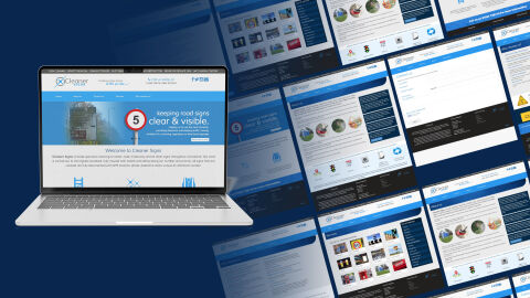
This portfolio showcase highlights the website design and digital presence development for Cleaner Signs. The objective was to design a highly structured, authoritative, and professional online platform that maintains a premium municipal and commercial maintenance standard while instantly communicating specialist sign cleaning, highway safety, and regional infrastructure maintenance solutions.
Design & Requirements Breakdown
Visual Symbolism - The user interface integrates a clean, service driven layout featuring realistic imagery of public road signs and clear, technical vector icons representing ladderless safety technology, sparkling cleanliness, and high visibility protective equipment to visually represent professional compliance, immediate visibility, and industrial reliability.
Typographic Architecture - A highly legible, modern sans-serif typeface structure gives the entire digital workspace a clean corporate and civic look, utilising varying font weights to neatly separate specialised services, company safety commitments, and direct call to action contact information for immediate scannability.
Premium Presentation - The fully structured, vertical vector composition allows for seamless multi device scaling, ensuring the layout presents perfectly across high resolution computer monitors, tablets, and mobile screens to optimise direct commercial inquiries and local council contracts.
Strategic Colour Choice - A refreshing, high visibility sky blue is paired with a striking safety red sign accent and clean white backdrops to evoke absolute civic trust, pristine cleanliness, and an energetic standard of public safety.
Target Audience Focus - The highly organised, authoritative layout is tailored to attract local government councils managing highway infrastructure, private commercial property owners needing corporate sign maintenance, and facilities managers seeking trusted, fully insured cleaning contractors.