
Cleaner Signs Sign Cleaning Services Flyer Design
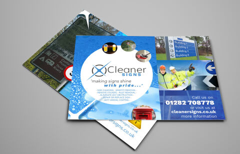
This portfolio showcase highlights the commercial print architecture and advertising layout for the Cleaner Signs Sign Cleaning Services Flyer Design. The objective was to design a highly professional, clean, and refreshing marketing flyer that bridges specialist trade authority with clear, informative graphic design, instantly communicating service precision, operational reliability, and structured business communication.
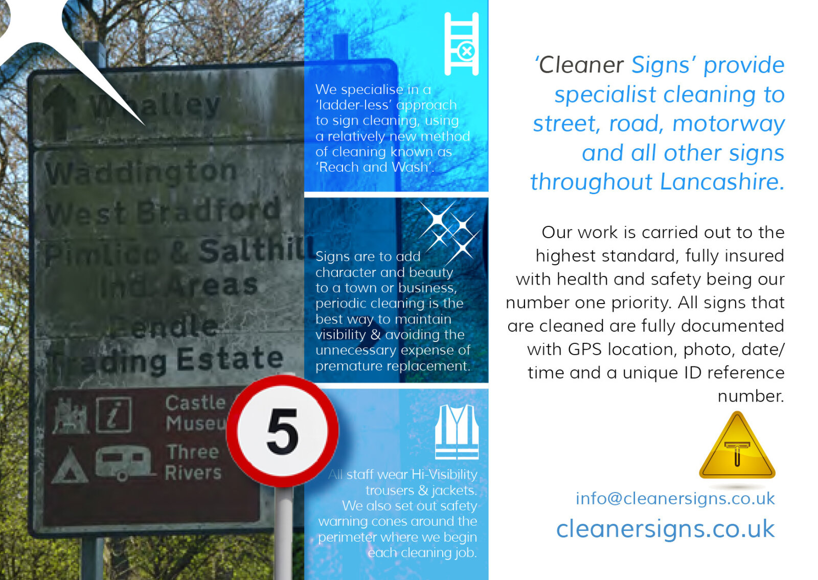
Design & Requirements Breakdown
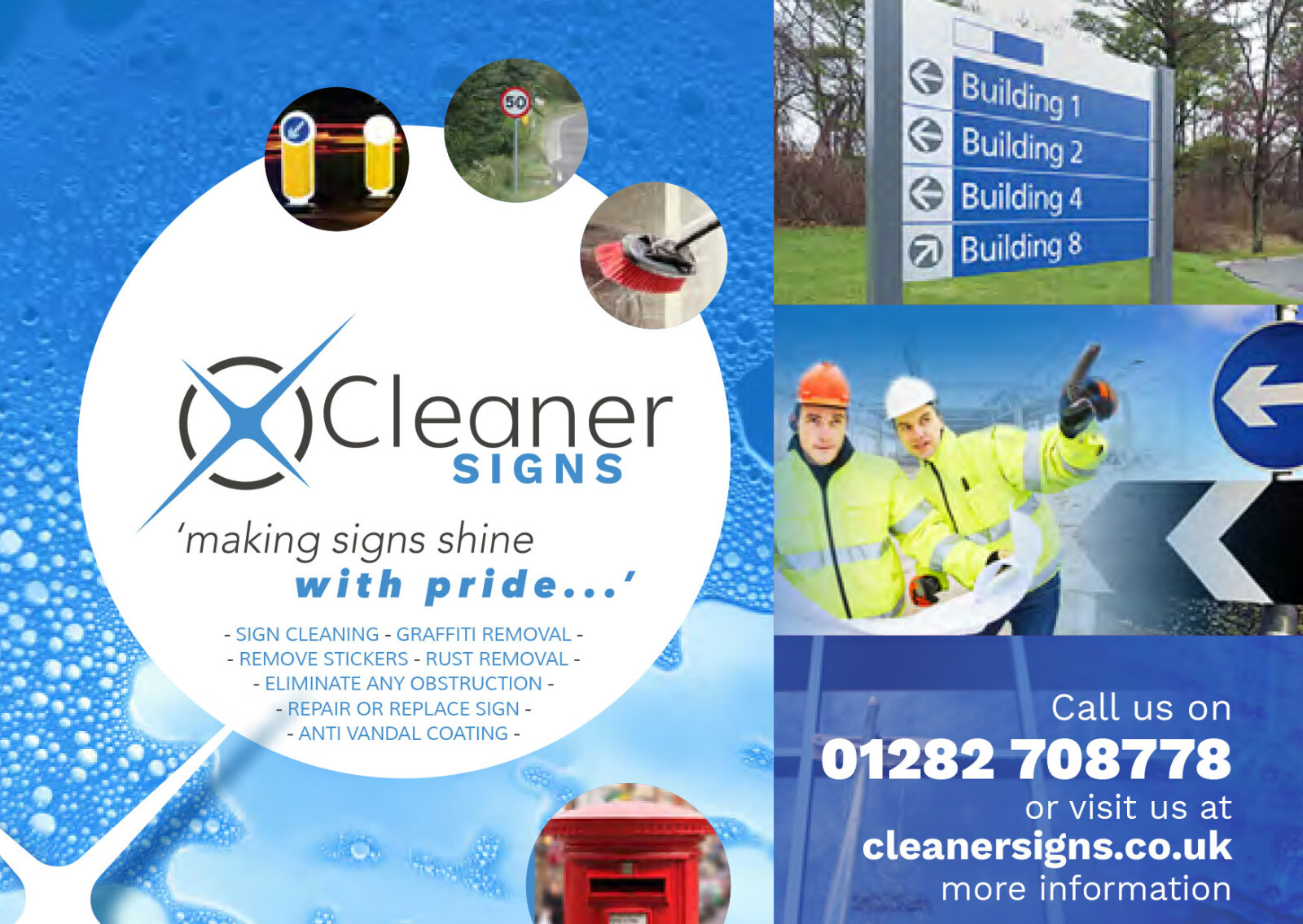
Visual Symbolism – The design features a prominent, circular white canvas anchoring the "Cleaner Signs" crosshair corporate emblem in the center. This aquatic theme is echoed beautifully across the background via a high definition, textured graphic of refreshing blue water droplets and active soap suds, visually reinforcing a meticulous cleaning standard. Surrounding the central badge are circular and rectangular micro photography showcases illustrating real world applications, including public signpost maintenance, anti graffiti removal, and postbox restorations.
Typographic Architecture – A clean, modern sans-serif display typeface blocks out the company name, accompanied by a smaller, stylised script tagline reading "making signs shine with pride..." in a vibrant azure blue. Beneath the primary brand mark, a neat, left aligned sans-serif list details core service capabilities, while the lower right quadrant blocks out essential contact phone numbers and digital web links in high contrast white text to keep a lightweight information hierarchy optimised for effortless reading.
Premium Presentation – The promotional collateral is presented in a premium 3D print mock up perspective showcasing a two page fanned arrangement with the front cover overlapping the reverse text canvas, resting at a dynamic angle on a neutral grey studio backdrop. This composition emphasises mass print production quality, authentic edge definitions, and realistic layout depth, offering a highly tactile preview of a complete commercial marketing touch point.
Strategic Colour Choice – A sophisticated, professional palette of deep royal blue, bright cyan, and soft sky blue forms the core brand signature and fluid background gradients, heavily contrasted by a crisp white writing canvas and high visibility yellow safety jacket accents within the photography. This distinct, high contrast palette evokes immediate municipal trust, hygiene logic, and a clean, recognisable specialist maintenance brand identity.
Target Audience Focus – The structured, service first layout is tailored to engage local government municipal authorities looking for public asset maintenance, commercial facility managers seeking reliable external sign cleaning partnerships, and private industrial estate operators demanding transparent, highly professional emergency or routine trade communication.