
Classical Fusion Cd Cover Design
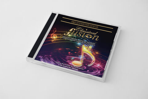
This portfolio showcase highlights the commercial print layout and graphic architecture for the Masterworks: Classical Fusion – An Electronic Musical Journey Through The World of Classics Compilation CD Cover Design. The objective was to design a highly atmospheric, visually electrifying and cosmic album cover that bridges timeless symphonic arrangements with synthesised electronic production, instantly communicating an immersive digital soundscape, cinematic energy and a striking product identity for retail distribution.
Design & Requirements Breakdown
Visual Symbolism – The design features a brilliant, glowing golden eighth note icon at the lower right quadrant, serving as the core visual narrative. This traditional music symbol sits at the centre of an energetic, swirling cosmic vortex of particle effects, abstract light streaks and neon sound wave trails that dance across the layout. This juxtaposition of classical music notation with hyper modern digital particle physics beautifully reflects the album’s thematic promise blending organic orchestral elements with futuristic electronic synthesizers and a deep, multi dimensional audio experience.
Typographic Architecture – The layout incorporates an intricate, high contrast typography hierarchy to ground its experimental musical theme. At the top header, the branding series title "MASTERWORKS" is blocked out inside thin, elegant parallel gold borders. Centered below, a graceful cursive script for "Classical" overlays a bold, stylised serif font for "Fusion," rendered with a metallic gradient and a brilliant lens flare accent. The descriptive subtitle "AN ELECTRONIC MUSICAL JOURNEY THROUGH THE WORLD OF CLASSICS" follows in a clean, all caps sans-serif layout. This deliberate typographic alignment preserves high fidelity readability across physical and digital storefronts while mirroring the premium, handcrafted nature of the audio production.
Premium Presentation – The promotional artwork is presented in a high fidelity digital and print preview composition, displaying the square jewel case booklet angled precisely against a clean, neutral grey studio backdrop. This focused mock up layout emphasises the sharp print resolution, the complex depth of the deep cosmic background gradients and the authentic sheen of the clear plastic casing, offering a highly tactile and professional preview of a completed commercial music release ready for physical package manufacturing or digital audio distribution.
Strategic Colour Choice – A sophisticated, multi layered palette of deep space indigo, cosmic purple and electric magenta forms the core brand signature canvas, providing an intense, modern background texture. This deep base is heavily illuminated by the radiant warmth of metallic gold typography, glowing lens flares, and vibrant amber accents in the treble clef motif. This deliberate colour configuration injects immediate cinematic movement, balancing the prestige of classical arrangements with a high energy electronic visual tone.
Target Audience Focus – The structured, concept first layout is meticulously tailored to engage classical music enthusiasts looking for refreshing electronic interpretations, ambient and synth wave audiophiles seeking grand symphonic crossover experiences and retail music shoppers demanding a transparent, highly professional package design that beautifully honors legendary compositions while showcasing an exciting, modern technological evolution.