
Churchill Window Cleaning Letterhead Design
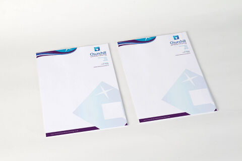
This portfolio showcase highlights the corporate identity layout and print asset coordination for the Churchill Window Cleaning Letterhead Design. The objective was to design a highly professional, clean, and reliable corporate letterhead that bridges industrial facility maintenance with premium residential care, instantly communicating pristine quality, service reliability, and structured corporate efficiency.

Design & Requirements Breakdown
Visual Symbolism – The design features a bold, oversized geometric window pane graphic layered in the lower right corner, subtly embedded with a crisp, four point sparkle star illustration. Across the top margin, a multi layered wave graphic arches gracefully alongside an integrated sparkle motif, visually reinforcing streak free precision, pristine glass clarity, and fluid, thorough service delivery.
Typographic Architecture – A clean, modern sans-serif typeface blocks out the company name "Churchill WINDOW CLEANING" beneath a stylised, diamond shaped corporate shield emblem. In the upper right hand margin, this typography maintains a highly precise alignment, cleanly balancing essential corporate contact coordinates, registration credentials, and digital links, keeping a lightweight information hierarchy optimised for effortless scanning.
Premium Presentation – The corporate stationery is showcased in a premium 3D print mock up presentation resting on a neutral, soft studio backdrop. This dual page layout composition highlights a pair of official letterheads side by side, emphasizing the uniform full bleed margins, precise edge trims, and crisp graphical balance suited for high end residential invoicing, commercial contracts, and official business correspondence.
Strategic Colour Choice – A sophisticated palette of deep royal purple and corporate cerulean blue forms the structural wave accents and solid footer bar, which are heavily contrasted by a crisp white paper canvas and a soft, ice blue geometric watermark. This high contrast, authoritative colour scheme evokes immediate operational trust, absolute cleanliness, and a distinct, premium trade identity.
Target Audience Focus – The structured, service first layout is tailored to engage corporate facility managers seeking certified commercial contract specialists, residential homeowners demanding premium property care, and business to business industry partners looking for a highly credible and well established brand presence.