
Childrens World Of Rhymes 101 Cd Cover Design
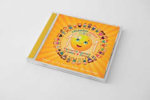
This portfolio showcase highlights the commercial print layout and graphic architecture for the Children's World of Rhyme – 101 Favourite Nursery Rhymes & Songs CD Cover Design. The objective was to design a highly engaging, joyful and vibrant album cover that bridges early childhood entertainment media with premium retail packaging, instantly communicating a sense of playfulness, high value content volume, and a clear product identity for retail distribution.
Design & Requirements Breakdown
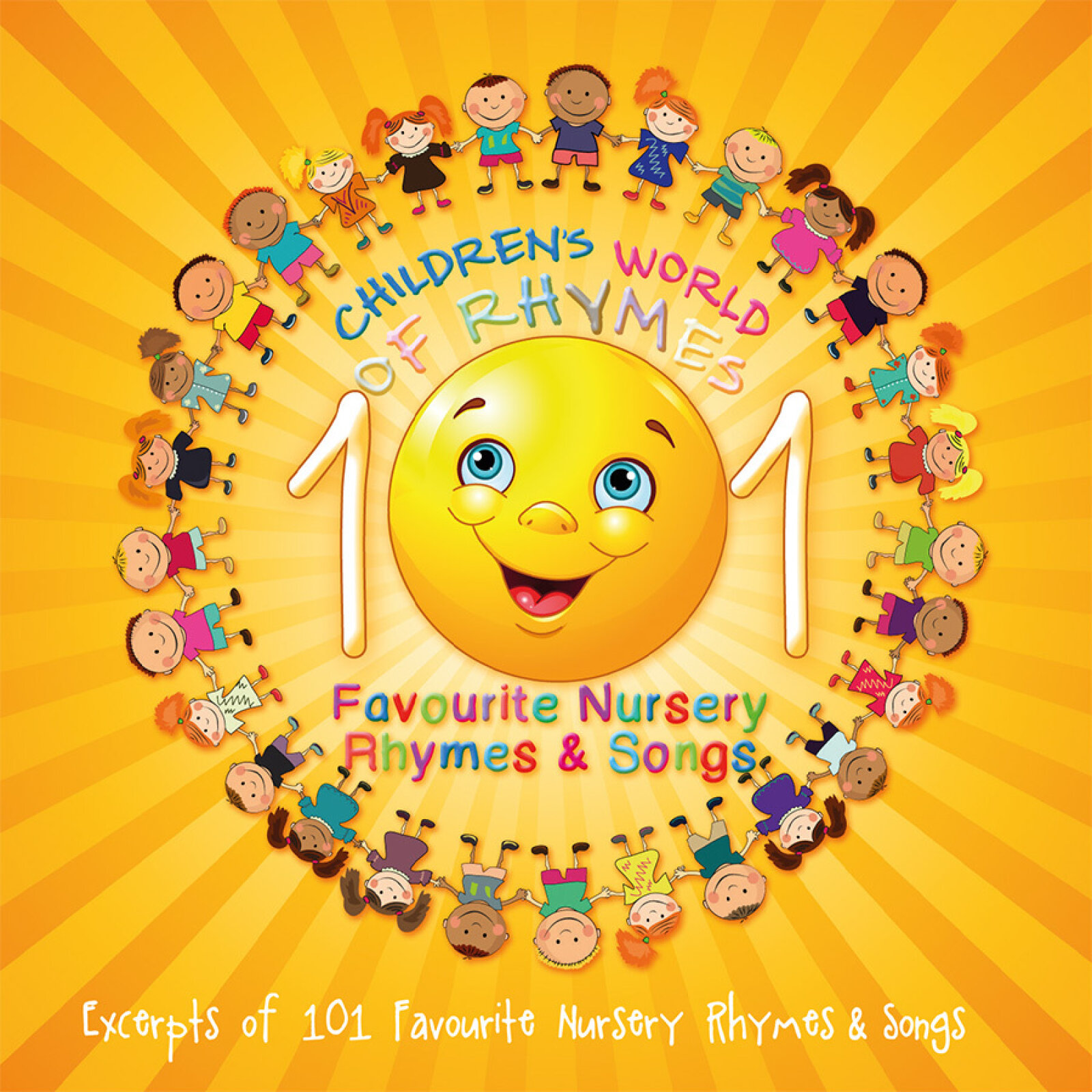
Visual Symbolism – The design features a cheerful, smiling 3D-style yellow sun character at the exact epicenter of the layout, radiating warmth and happiness. This playful theme is beautifully layered into a circular graphic architecture, with a diverse ring of illustrated, hand holding cartoon children holding hands in a global circle around the central sun. An energetic, sweeping sunburst pattern radiates outward from the centre across the entire background canvas, visually reinforcing inclusivity, rhythmic motion and an exciting, melody filled journey.
Typographic Architecture – A playful, multi colored casual font blocks out the primary series brand "CHILDREN'S WORLD OF RHYME" in a curved arch format crowning the central graphic. Dominating the horizontal axis, the number "101" is rendered in a heavy, high contrast white font with subtle drop shadows to emphasise massive track value. Directly beneath, a clean, bold sans-serif font cleanly structures the secondary title details, "Favourite Nursery Rhymes & Songs," in a rich crimson red. A lightweight, playful sub heading along the base repeats the track contents to keep a lightweight information hierarchy optimised for parents scanning retail displays.
Premium Presentation – The promotional artwork is presented inside a premium, high definition retail jewel case mockup perspective, showcasing the front booklet layout sitting behind a realistic clear plastic protective tray and an accented yellow spine strip. The composition is set at a dynamic angle on a neutral, smooth white studio backdrop, capturing realistic edge reflections and subtle material depth to offer a highly tactile and retail-ready preview of a completed physical media product.
Strategic Colour Choice – A sophisticated, energy focused palette of deep orange, bright yellow, and crisp white forms the core brand signature canvas background, heavily punctuated by the primary colours within the children's outfits and the bold crimson text elements. This distinct, high contrast palette evokes immediate youthful excitement, friendly education logic, and a highly recognisable children's media brand identity that stands out beautifully on store shelving or digital audio marketplaces.
Target Audience Focus – The structured, value first layout is tailored to engage parents and caregivers looking for an extensive collection of educational and entertaining audio tracks, family members seeking a fun, premium birthday gift, and early childhood educators demanding high quality, transparently marketed sing along resources for classroom play and activity periods.