
Children's World 101 Songs And Rhymes
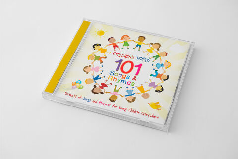
This portfolio piece highlights the commercial print layout and graphic architecture for the Children's World 101 Songs & Rhymes CD Cover Design. The objective was to design a highly welcoming, inclusive, and uplifting album cover that bridges early childhood entertainment media with premium retail packaging, instantly communicating a vast variety of tracks, cultural unity and a clear product identity for retail distribution.
Design & Requirements Breakdown
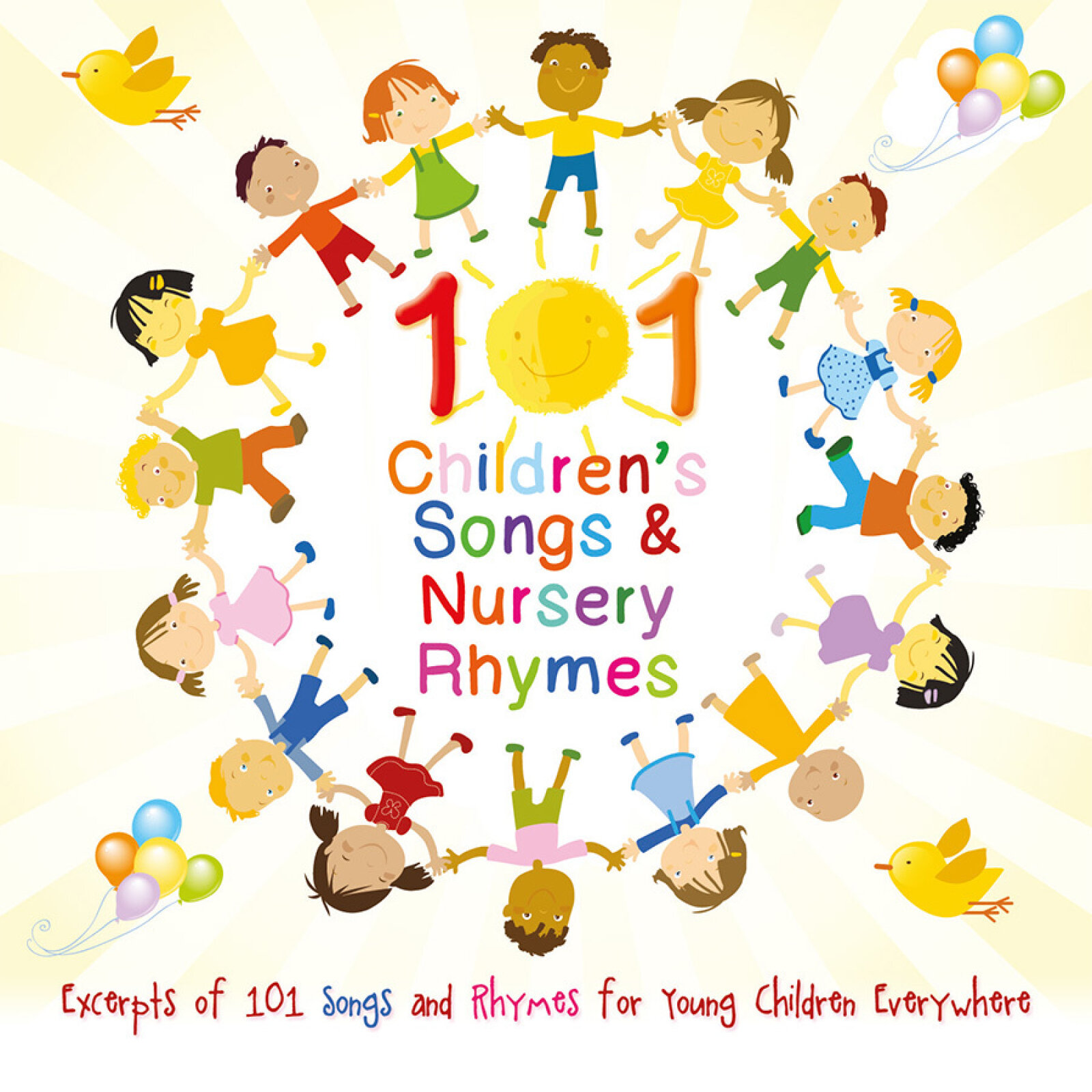
Visual Symbolism – The design features a diverse group of illustrated children holding hands in a perfect, continuous circle at the exact epicenter of the layout, serving as the core visual narrative. This global, unified theme is beautifully layered into the graphic architecture via a smiling yellow sun in the upper left quadrant, floating pastel balloons, a soaring little bird in the lower right corner, and a soft, abstract bokeh background canvas. This thoughtful visual configuration seamlessly reinforces themes of friendship, shared learning, active play and a harmonious, melody filled journey.
Typographic Architecture – A playful, casual display typeface structures the main branding elements directly inside the ring of children. The sub headline "CHILDREN'S WORLD" curves gently in a soft blue, while the massive, high visibility headline "101" anchors the focal point in a bold gradient magenta, followed immediately by "Songs & Rhymes" rendered in alternating primary colours. Along the bottom margin, a clean cursive script spells out the descriptive baseline, "Excerpts of Songs and Rhymes for Young Children Everywhere," keeping a lightweight information hierarchy optimised for parents scanning retail displays.
Premium Presentation – The promotional artwork is presented inside a high fidelity retail jewel case mock up perspective, showcasing the front booklet layout sitting behind a realistic clear plastic protective tray and a solid golden yellow spine strip. The presentation is set at an angled, perspective orientation against a neutral, smooth white studio backdrop, capturing realistic edge reflections and subtle material depth to offer a highly tactile and retail ready preview of a completed physical media product.
Strategic Colour Choice – A sophisticated, soft palette of clean white and warm cream tones forms the core background canvas, allowing the vibrant primary colours of the children's outfits, the bold magenta numbers and the sunny yellow spine to pop dynamically. This distinct, balanced palette evokes immediate youthful excitement, friendly education logic, and a highly recognisable children's media brand identity that stands out beautifully on store shelving or digital audio marketplaces.
Target Audience Focus – The structured, value first layout is tailored to engage parents and caregivers looking for an extensive, value packed collection of educational tracks, family members seeking a fun, premium gift, and early childhood educators demanding high quality, transparently marketed sing along resources for classroom play and activity periods.