British Defenders Stationary Design
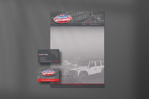
This portfolio showcase highlights the corporate identity layout and print asset coordination for the British Defenders Business Stationery. The objective was to design a rugged, highly authoritative, and premium identity system that bridges classic automotive heritage with extreme off road capability, instantly communicating vehicle reliability, specialist engineering, and an adventurous brand lifestyle.
Design & Requirements Breakdown
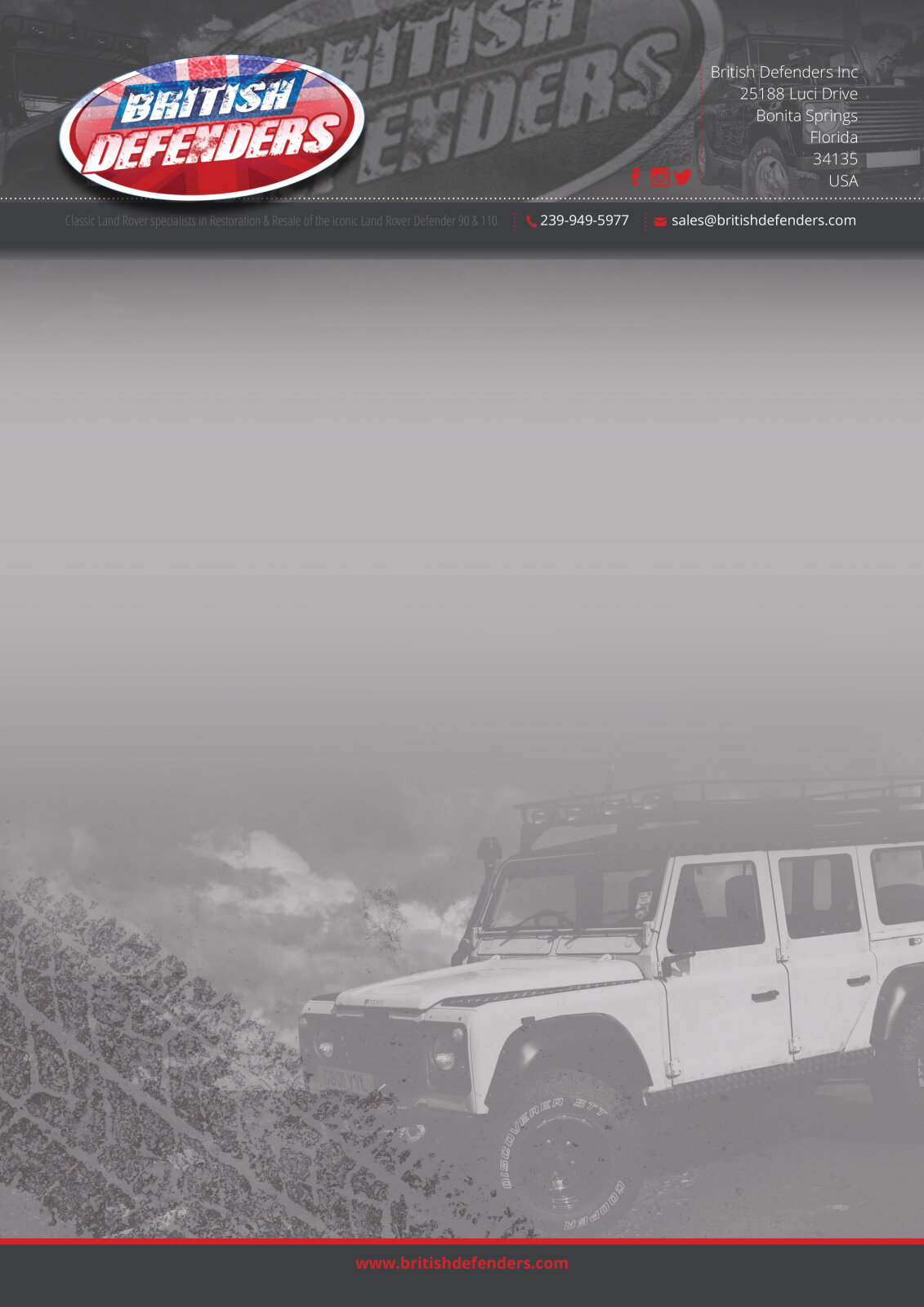
Visual Symbolism – The design features a dramatic, full bleed grey scale background photograph of a rugged 4x4 utility vehicle tackling rough terrain, overlaid across the lower half of the official letterhead. A textured, distressed metal watermark motif sweeps across the dark headers and business cards, while the primary 3D brand badge complete with an integrated Union Jack graphic is proudly anchored in the upper left, visually reinforcing mechanical endurance, robust craftsmanship, and authentic British heritage.
Typographic Architecture – A bold, high impact sans-serif display typeface delivers the company name "BRITISH DEFENDERS" within a stylised oval logo badge. Across the executive business card layout, clean sans-serif typography maintains a rigid and precise alignment, balancing personal credentials such as the name "Cristian Page" with essential coordinates like telephone, mobile numbers, and digital links, keeping a lightweight information hierarchy optimised for quick reading.
Premium Presentation – The stationery collection is showcased in a premium 3D print mock up presentation resting on a dark slate grey backdrop. This structured composition highlights an official corporate letterhead paired with two distinct business cards displaying both the text based contact front and the textured, brand focused backing, demonstrating a polished, professional suite optimised for specialist automotive garages, vehicle parts distribution, and executive corporate correspondence.
Strategic Colour Choice – A commanding palette of deep charcoal black, industrial greys, and a striking racing red forms the core brand canvas and thin footer rules, contrasted by crisp white text and the colourful Union Jack emblem accents. This high contrast, moody colour scheme evokes extreme durability, mechanical power, and a premium, adventure focused corporate identity.
Target Audience Focus – The rugged, performance first layout is tailored to engage luxury 4x4 vehicle owners seeking premium restoration services, off road enthusiasts searching for highly durable performance hardware, and corporate trade partners looking for a credible, robust, and well established automotive brand presence.