
British Defenders Product Flyer Design
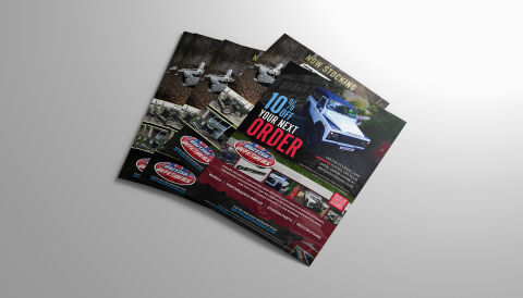
This portfolio showcase highlights the commercial print architecture and multi unit marketing layout for the British Defenders product flyer design. The objective was to design a highly professional, rugged and impactful promotional flyer that bridges automotive restoration authority with clear marketing layout, instantly communicating component precision, specialist 4x4 reliability, and a streamlined digital conversion path for repeat customers.
Design & Requirements Breakdown
Visual Symbolism – The design features a realistic, high fidelity lifestyle photography panel showcasing a rugged white custom defender traversing off road terrain, serving as the primary visual anchor. This mechanical theme is beautifully supported across the layout via a dark, textured grunge background canvas and a segmented row of product thumbnails detailing specialised machinery, undercarriage restorations and upgraded performance builds, visually reinforcing automotive engineering expertise, elite component supply and brand transparency.
Typographic Architecture – An ultra bold, condensed sans-serif display typeface blocks out the primary promotional message "10% OFF YOUR NEXT ORDER" across the central left quadrant, utilising an alternating bright blue and vibrant crimson red color hierarchy to maximise immediate readability. The corporate header features a clean sans-serif layout reading "NOW STOCKING," anchored by the distinct oval "British Defenders" corporate emblem. In the lower margins, a highly legible sans-serif font maintains a precise alignment to structure service categories such as Performance Builds, Chassis Parts, and Restorations, keeping a lightweight information hierarchy optimised for quick reading.
Premium Presentation – The promotional collateral is presented in a premium 3D print mock up perspective showcasing a fanned, overlapping stack of printed flyer sheets resting at a dynamic angle on a neutral, soft grey studio backdrop. This composition emphasises mass print production quality, crisp edge definitions, and repetitive brand exposure, offering a highly tactile preview of an unboxing marketing touch point or an industrial trade counter handout.
Strategic Colour Choice – A sophisticated, automotive first palette of deep charcoal black, electric blue, and vivid crimson red forms the core brand signature canvas and promotional highlights, heavily contrasted by a crisp white text layout and realistic vehicle photo tones. This distinct, high impact palette evokes immediate mechanical trust, industrial logic, and an energetic, highly recognisable automotive brand identity that stands out in a crowded retail delivery.
Target Audience Focus – The structured, retention first layout is tailored to engage professional fleet operators looking for immediate 4x4 commercial solutions, independent mechanical workshop owners seeking reliable component supply partnerships, and off road automotive enthusiasts demanding transparent, premium grade mechanical parts communication that rewards brand loyalty.