
Blooming Little Kids Cd Cover Design
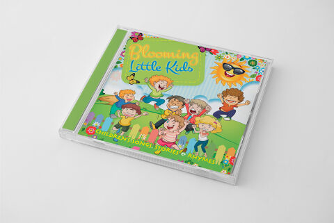
This portfolio showcase highlights the commercial print layout and graphic architecture for the Blooming Little Kids CD Cover Design. The objective was to design a highly engaging, joyful, and whimsical album cover that bridges early childhood entertainment media with premium retail packaging, instantly communicating a sense of youthful playfulness, interactive content and a clear product identity for retail distribution.
Design & Requirements Breakdown
Visual Symbolism – The design features a lively group of illustrated cartoon children playing on a sun dappled green hillside, serving as the core visual narrative. This outdoor, energetic theme is beautifully layered into the graphic architecture via a smiling cartoon sun wearing sunglasses in the upper right quadrant, fluttering butterflies, a colourful picket fence, and blooming flower beds framing the lower margins. This rich visual composition seamlessly reinforces themes of active discovery, childhood growth and a bright, melody filled journey.
Typographic Architecture – A playful, friendly cursive script font blocks out the main title "Blooming Little Kids" inside a stylised green stitched fabric label element in the upper left corner, utilising bright orange and blue tones to maximise youthful appeal. Along the lower margin, an ultra legible, bright yellow sans-serif font cleanly structures the secondary descriptive tag, "CHILDREN'S SONGS, STORIES & RHYMES!", anchored on each side by miniature flower icons to keep a lightweight information hierarchy optimised for parents scanning retail displays.
Premium Presentation – The promotional artwork is presented inside a high fidelity retail jewel case mock up perspective, showcasing the front booklet layout sitting behind a realistic clear plastic protective tray and a solid lime green spine strip. The presentation is set at an angled, perspective orientation against a neutral, smooth white studio backdrop, capturing crisp plastic edge cuts and subtle surface shadows to offer a highly tactile and retail ready preview of a completed physical media product.
Strategic Colour Choice – A sophisticated, nature inspired palette of vibrant meadow greens, sky blues, and warm sunny yellows forms the core brand signature canvas background, heavily punctuated by the multi-coloured clothing of the children characters and the bright orange title text. This distinct, high contrast palette evokes immediate youthful excitement, friendly education logic, and a highly recognisable children's media brand identity that stands out beautifully on store shelving or digital audio marketplaces.
Target Audience Focus – The structured, play first layout is tailored to engage parents and caregivers looking for an educational and entertaining collection of children's tracks, family members seeking a fun, premium gift, and early childhood educators demanding high quality, transparently marketed sing along resources for classroom play and activity periods.