
Blackpool Property Rentals Logo Design
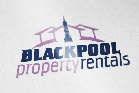
This portfolio showcase highlights the brand identity development for Blackpool Property Rentals. The objective was to design a reliable, modern, and locally rooted emblem that instantly communicates regional pride, accommodation expertise, and a trustworthy approach to coastal lettings and property management.
Design & Requirements Breakdown
Visual Symbolism - The icon dynamically bridges local heritage and real estate by integrating the iconic silhouette of the Blackpool Tower directly between the clean, structural outlines of two residential rooftops.
Typographic Architecture - A heavy, impact driven sans-serif typeface is utilised for "BLACKPOOL" to anchor the brand with solid stability, beautifully balanced below by a lighter, contemporary font for the property service text.
Premium Presentation - The digital vector layout transitions seamlessly into high gloss print media, utilising a subtle raised spot-UV layer that catches the light across the typography on textured corporate stationery.
Strategic Colour Choice - A deep, corporate navy blue evokes absolute professional trust and security, while vibrant shades of lavender and violet inject a fresh, welcoming, and modern hospitality energy.
Target Audience Focus - The highly professional yet distinctly local design is tailored to appeal to property landlords seeking reliable management and tenants looking for trusted, quality rentals in the Blackpool area.