
Better By Now By Heather Little - Single Cover Design
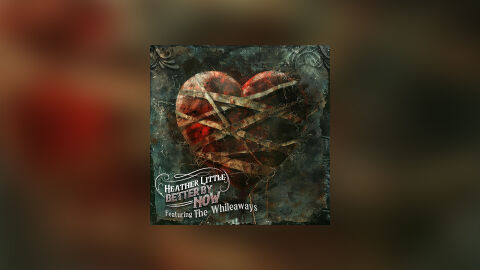
This portfolio design idea highlights the commercial print layout and graphic architecture for Heather Little’s "Better By Now" single release, featuring The Whileaways. The objective was to design a deeply tactile, visceral and emotionally charged single cover that captures a dark folk, gothic Americana with indie roots aesthetic. The layout instantly communicates themes of healing, emotional scarring and collaborative storytelling, optimised for high impact presence on digital streaming platforms and physical distribution.
Design & Requirements Breakdown
Visual Symbolism - The design features a heavily textured, anatomical style heart wrapped tightly in weathered bandages, serving as the core visual narrative. The distressed, fractured surface of the heart combined with the binding elements powerfully symbolises trauma, resilience and the slow, painful process of putting oneself back together. This evocative focal imagery seamlessly reinforces the single's raw lyrical themes, offering a striking visual metaphor that anchors the entire musical release.
Typographic Architecture - The layout incorporates the artist's signature typography system, positioned in the lower left quadrant to manage the single's identity. The artist's name "HEATHER LITTLE" and track title "BETTER BY NOW" are nestled cleanly within a custom, flowing filigree frame that aligns with her established visual brand. Directly below, the guest feature text "Featuring The Whileaways" is rendered in a complementary, elegant script. This deliberate placement keeps the central heart icon unobstructed while framing the composition with classic, ornate corner flourishes.
Premium Presentation - The promotional artwork is presented in a high fidelity digital preview composition, framing the square single cover art precisely against a heavily blurred and dark studio vignette backdrop. This backdrop echoes the out of focus, earthy crimson and deep shadow tones of the central photograph. This focused layout highlights the intricate digital texturing, the rich depth of the canvas layers and the clean boundary lines of the artwork, offering a polished preview ready for global streaming storefronts.
Strategic Colour Choice - A moody, complex palette of oxidised teals, verdigris greens and deep charcoal greys forms the foundational background canvas, creating an antique, weathered stone and metallic feel. This cold, textured atmosphere is powerfully contrasted by the rich, blood red and amber tones of the central heart. This distinct colour configuration injects an immediate sense of organic life and emotional urgency, ensuring the artwork catches the eye even as a small thumbnail on crowded digital storefronts.
Target Audience Focus - The structured, narrative first layout is meticulously tailored to engage fans of modern folk, country and storytelling singer songwriters looking for deep thematic music, vinyl and CD collectors seeking premium artistic packaging and music consumers demanding a raw, highly professional package design that beautifully honours a powerful and evocative acoustic single release.