
Better By Now by Heather Little - Album Design
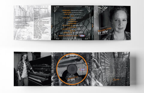
This portfolio piece highlights the authentic art direction and poignant, heritage focused layout architecture for Heather Little’s studio album, "By Now." The design objective was to build a raw, deeply personal multi-panel packaging layout that perfectly fits acoustic Americana, roots folk and heartfelt storytelling music. The layout relies on intimate, documentary style photography to instantly establish themes of reflection, rural heritage, and personal history, optimised for a cohesive, tactile experience across physical CD merchandise and promotional displays.
Design & Requirements Breakdown
Typographic Architecture – The design uses a coordinated, stylised typography layout anchored thoughtfully across the panels. The album title and artist branding "HEATHER LITTLE - BY NOW" is rendered in a custom, hand lettered vintage style inside a dynamic banner graphic, utilising a warm, rustic orange that guarantees instant visibility. On the track list panel, the song titles are displayed in a clean, high contrast white sans-serif font, accompanied by stylised corner flourishes that frame the typography and evoke a timeless, classic Americana aesthetic.
Premium Presentation – The promotional artwork is displayed as a high fidelity packaging mock up, showing both the exterior and interior views of a three panel gate fold CD digipak. The presentation cleanly maps out the physical user journey, from the striking artist portrait on the cover to the detailed lyric panels, complete track listing and the custom disc placement. This thorough layout arrangement draws the viewer's immediate focus to how the visual narrative unfolds seamlessly as the consumer opens the physical package.
Strategic Colour Choice – The colour palette relies on a moody, de-saturated monochromatic scheme of deep blacks, rich charcoals and vintage greys, establishing a timeless and classic documentary feel. By keeping the photographic elements in black and white, the focus shifts entirely to the raw emotion of the portraits and the textures of the rural landscapes. A deliberate pop of vibrant orange is used strategically on the branding stamps, disc artwork and the artist's signature, injecting energy into the design while guiding the eye to critical information.
Target Audience Focus – The historic, narrative first layout is meticulously crafted to engage enthusiasts of traditional storytelling music, vinyl and CD collectors looking for premium aesthetic packaging, and music consumers demanding an authentic, highly professional design that honours grassroots singer songwriter traditions and emotional storytelling.