
Backsoothers Ecommerce Design
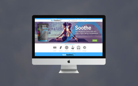
This portfolio showcase highlights the e-commerce website design and digital storefront development for Back Soothers. The objective was to design a clean, therapeutic, and highly professional online platform that maintains corporate alignment with the parent brand while instantly communicating spinal comfort, ergonomic relief, and specialised back care solutions.
Design & Requirements Breakdown
Visual Symbolism - The user interface integrates a clinical yet accessible wellness layout, featuring active lifestyle imagery of individuals practicing therapeutic yoga, crisp 3D product packaging mock ups, and a line of core medical grade trust icons that visually represent certified relief, posture correction, and anatomical wellness.
Typographic Architecture - A friendly, highly legible sans-serif typeface gives the layout a modern medical look, mirroring the exact font structure of the sister brand and utilising prominent, high contrast headings alongside clear call to action buttons to ensure immediate user legibility and streamlined navigation.
Premium Presentation - The balanced, wide screen desktop composition allows for seamless multi device scaling, ensuring the layout presents perfectly across high resolution computer monitors, tablets, and smartphones to optimise digital storefront conversions and brand presentation.
Strategic Colour Choice - A calming, medical grade sky blue is paired with crisp white backdrops and vibrant, high energy green action buttons to evoke absolute clinical trust, refreshing wellness, and an approachable health standard.
Target Audience Focus - The clean, comforting layout is tailored to attract office workers suffering from back strain, individuals recovering from injury, and everyday consumers looking for a trusted, therapeutic pain relief brand.