
Back Soothers Back Brace Package Design
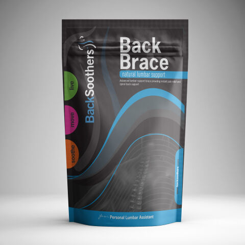
This portfolio showcase highlights the packaging design and visual branding for the Back Soothers Lumbar Support Back Brace. The objective was to design a high impact, modern stand up pouch that blends therapeutic authority with an active lifestyle aesthetic, instantly communicating relief, ergonomic spinal support, and daily mobility.
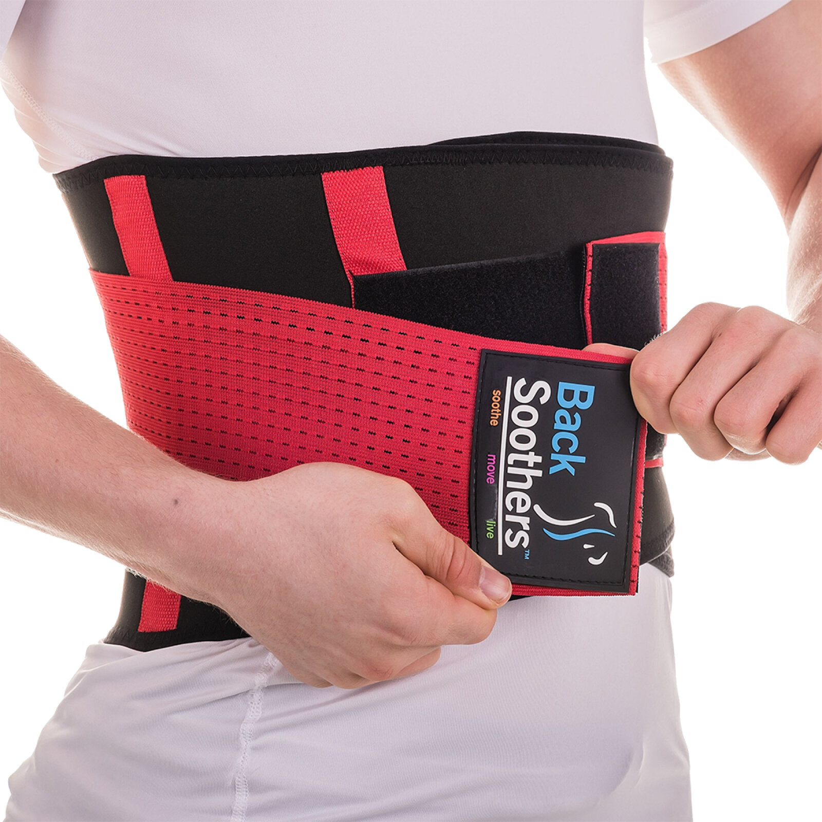
Design & Requirements Breakdown
Visual Symbolism – The design features a stylised spine illustration and flowing ergonomic blue waves against a dark charcoal backdrop, visually representing spinal alignment, fluid movement, and core stabilisation. Distinct colour coded badge call outs ("live", "move", "soothe") on the left border reinforce a three step lifestyle benefit.
Typographic Architecture – A dominant, bold sans-serif header commands immediate shelf attention with "Back Brace," accompanied by clean, high legibility secondary text detailing the product's function as a "natural lumbar support" and "personal lumbar assistant" for quick consumer comprehension.
Premium Presentation – The matte finish stand up pouch with a resealable zip lock closure provides a sleek, modern alternative to traditional medical packaging. The structural pouch design offers full bleed visual impact while maintaining durability for retail display and extended customer use.
Strategic Colour Choice – Deep slate and charcoal grays form a technical, premium baseline, accented by vibrant ocean blue, energetic lime green, magenta, and warm orange highlights to evoke relief, dynamic vitality, and ergonomic care.
Target Audience Focus – The active, wellness driven design is tailored to engage individuals suffering from lower back discomfort, fitness enthusiasts seeking core stability, and everyday desk workers looking for non invasive, therapeutic postural support.