
Baby Tranquillity Cd Cover Design
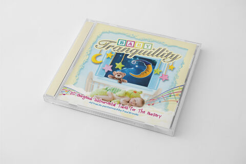
This portfolio design piece highlights the commercial print layout and graphic architecture for the Baby Tranquillity: 20 Gorgeous Instrumental Tunes For The Nursery Compilation CD Cover Design. The objective was to design a highly atmospheric, soothing and whimsical album cover that bridges gentle early childhood wellness with premium physical packaging, instantly communicating a sense of serene comfort, peaceful sleep and a striking product identity for retail distribution.
Design & Requirements Breakdown
Visual Symbolism – The design features a gentle, multi layered dreamscape composition at the centre of the layout, serving as the core visual narrative. An illustration of a nursery window looks out into a starry night sky, anchored by a smiling crescent moon, dangling pastel stars and a soft teddy bear peeking over the sill. Directly below this central frame is a realistic, heartwarming photograph of a sleeping infant resting peacefully alongside a plush caterpillar toy. This thoughtful combination of playful cartoon elements and tender real world imagery seamlessly reinforces themes of night time comfort, emotional security and a calming lullaby environment.
Typographic Architecture – The layout manages its information hierarchy using a charming, multi font arrangement tailored for children's media. The word "BABY" is spelled out in a stylised, multicolored toy block design across the upper quadrant, leading into a flowing, gold textured script font for the main title "Tranquillity". Across the lower third, the descriptive subtitle "20 Gorgeous Instrumental Tunes For The Nursery" is rendered in a playful, hand written style crimson script font, followed by a clean, lightweight sans-serif credit reading "All tracks performed by Paul Brooks". This deliberate typographic alignment remains highly legible while establishing a friendly, premium nursery branding signature.
Premium Presentation – The promotional artwork is presented in a high fidelity digital and print preview composition, displaying the square jewel case booklet angled precisely against a clean, neutral white studio backdrop. This focused mock up layout emphasises the sharp print resolution, the clarity of the clear plastic casing, and the soft cream toned spine strip accent, offering a highly tactile and professional preview of a completed commercial music release ready for retail distribution or physical package manufacturing.
Strategic Colour Choice – A sophisticated, calming palette of soft pastel yellows, sky blues and gentle creams forms the primary canvas, instantly evoking a sense of psychological rest and nursery warmth. This soothing foundation is beautifully accented by pop colours like festive red script, a vibrant yellow moon and soft pink star ornaments. This deliberate colour configuration injects a comforting visual energy, ensuring the package stands out beautifully to parents browsing children's entertainment and relaxation displays in physical and digital retail environments.
Target Audience Focus – The structured, concept first layout is meticulously tailored to engage new parents, relatives and caregivers looking for high quality sleep aids and relaxation soundtracks for infants. It captures the attention of retail music shoppers demanding a transparent, highly professional package design that beautifully honours the album's gentle, nurturing and soothing themes.