
Angelukas Gents Hairdressers Logo Design
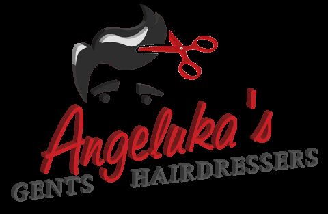
This portfolio showcase highlights the brand identity development for Angeluka's Gents Hairdressers. The objective was to design a sharp, contemporary, and highly expressive emblem that instantly communicates modern men's grooming, sharp styling expertise, and a welcoming salon atmosphere.
Design & Requirements Breakdown
Visual Symbolism - The icon features a stylised vector illustration of a modern, swept back men's hairstyle paired with sharp, open scissors to immediately represent precise barbering and hair design.
Typographic Architecture - A flowing, energetic red script font is used for "Angeluka's" to inject a sense of personalised flair, anchored below by a heavy, industrial sans-serif typeface for the core business description.
Premium Presentation - The composition utilises clean, hard edged shading on the text and graphics, creating a distinct three dimensional pop that translates perfectly to salon window decals, capes, and business cards.
Strategic Colour Choice - A vibrant, passionate red is contrasted against deep charcoal greys and black to evoke a bold, masculine, and high energy street side presence.
Target Audience Focus - The sharp, illustrative layout is carefully tailored to attract modern style conscious men, young professionals, and local clients looking for premium, trendy gents' styling and grooming.