
Amongst The Stars By System Sync Music Single Cover Design
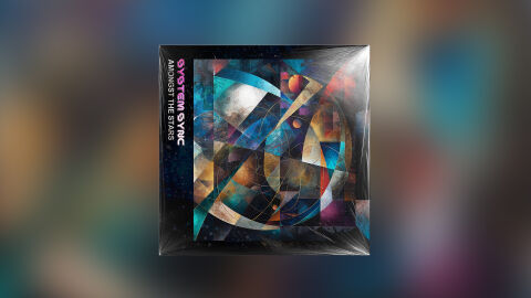
This portfolio design piece highlights the commercial print layout and graphic architecture for the System Sync Amongst The Stars Music Single Cover Design. The objective was to design a highly atmospheric, visually hypnotic, and cosmic single cover that bridges progressive electronic music with premium packaging, instantly communicating a sense of interstellar exploration, complex digital geometry, and a striking product identity for retail distribution.
Design & Requirements Breakdown
Visual Symbolism – The design features an intricate, multi layered abstract collage at the exact epicenter of the layout, serving as the core visual narrative. Sharp geometric shards, intersecting curved lines, and cosmic textures overlap to evoke the feeling of a futuristic star map or a deep space navigational matrix. Embedded within this graphic architecture are faint celestial bodies, glowing dust nebulae, and mathematical vector tracks, which seamlessly reinforce underlying themes of technological evolution, infinite space, and an expansive electronic audio journey.
Typographic Architecture – The layout utilises a clean, modern vertical text alignment locked tightly into a dark spine border on the left hand side. The artist's name "SYSTEM SYNC" is rendered in a bold, stylised electronic display typeface featuring a bright magenta glow. Directly beneath, the track title "AMONGST THE STARS" is split into a crisp, high contrast white sans-serif font block. This deliberate typographic alignment establishes a highly structured information hierarchy optimised for effortless reading across streaming platform grids or physical shelf displays, creating a distinct, high tech branding signature.
Premium Presentation – The promotional artwork is presented in a high fidelity digital and print preview composition, displaying the square jacket encased in a glossy, realistic plastic shrink wrap layer. This mock up layout is beautifully framed against a soft, heavily blurred background that mimics the vibrant ambient lighting of a studio space. This focused presentation emphasises the sharp print resolution, the rich depth of the dark celestial tones and the tactile reflections on the plastic casing, offering a highly professional preview of a completed commercial release ready for digital audio distribution or physical manufacturing.
Strategic Colour Choice – A sophisticated, moody foundation of deep space blues, stark blacks, and textured charcoal greys forms the core brand signature canvas. This atmospheric background is heavily contrasted by a brilliant spectrum of neon teals, cosmic oranges, and electric magentas woven through the central geometry and typography. This distinct, high contrast colour palette injects immediate cinematic intrigue, electronic authenticity, and a mature visual identity that cuts through competing digital storefronts and social media grids.
Target Audience Focus – The structured, concept first layout is meticulously tailored to engage dedicated synth wave, ambient, and progressive electronic music collectors looking for authentic releases, enthusiasts who appreciate complex geometric or cosmic iconography and retail music consumers demanding a transparent, highly professional package design that beautifully honors the track's futuristic, interstellar theme.