
Adventures Of Peter Kim Book Cover Design
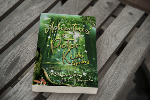
This portfolio showcase highlights the commercial cover illustration and print jacket layout for the Adventures of Peter Kim Book Design Cover. The objective was to design a highly professional, enchanting and whimsical book cover that bridges children's fantasy fiction with vibrant editorial graphics, instantly communicating magical adventure, woodland wonder and an engaging visual narrative that stands out on a physical or digital bookstore shelf.
Design & Requirements Breakdown
Visual Symbolism – The design features an immersive, sun dappled forest background canvas filled with towering green trees and a lush floor of spring wildflowers. This fairy tale theme is beautifully layered into the graphic architecture via a circling constellation of glowing white stars that orbit the central text, a gnarled mossy tree trunk detailed with miniature orange mushrooms in the lower left corner and a delicate leafy vine framing the upper right margin, visually reinforcing natural discovery, mystical realms and a whimsical narrative journey.
Typographic Architecture – A flowing, elegant script typeface rendered in a metallic gold gradient blocks out the primary title "Adventures of Peter Kim" across the upper half, enhanced with subtle drop shadows to create realistic depth against the foliage. Directly below the main name, a matching sans-serif font emphasises the seasonal setting, "Spring". The base of the cover integrates a refined italicized font to display the secondary tagline, "A Magical Story," balanced neatly above the author attribution "By Susan Alexander" to keep a lightweight information hierarchy optimised for effortless reading.
Premium Presentation – The promotional asset is presented in a premium 3D book mock up perspective showcasing a single paperback volume resting at an angle on a weathered, grey wooden slat bench backdrop. This organic composition emphasises mass print production quality, clean paper book block edges and realistic environmental lighting, offering a highly tactile and atmospheric preview of a completed children's literature touch point.
Strategic Colour Choice – A sophisticated, nature inspired palette of deep forest greens, emerald moss tones, and crisp whites forms the core brand signature canvas, heavily punctuated by the rich golden fonts and organic pops of orange and lilac from the flora. This distinct, high contrast palette evokes immediate youthful curiosity, mystical logic, and an easily recognisable literary identity that commands attention from passing young readers and parents alike.
Target Audience Focus – The structured, concept first layout is tailored to engage early readers looking for imaginative fantasy tales, parents seeking wholesome and visually engaging storybooks for their children and digital bookstore shoppers demanding a high quality, enchanting cover design that promises an immersive, magical reading experience.