
1 Stop Tyres And Auto Centre Logo Design

This portfolio showcase highlights the brand identity development for 1 Stop Tyres & Auto Centre. The objective was to design a high energy, authoritative, and multi-layered emblem that positions the business as a comprehensive, all in one destination for automotive care and tyre services.
Design & Requirements Breakdown
Visual Symbolism - The icon integrates realistic tyre graphics at the base and a diverse array of mechanical tools which include spanners, pliers, and spark plugs that are peeking from the top to immediately represent complete mechanical expertise.
Typographic Architecture - A bold, heavy, and forward leaning italic sans-serif typeface is utilised for "1 STOP" to inject an immediate sense of mechanical speed, industrial power, and efficiency.
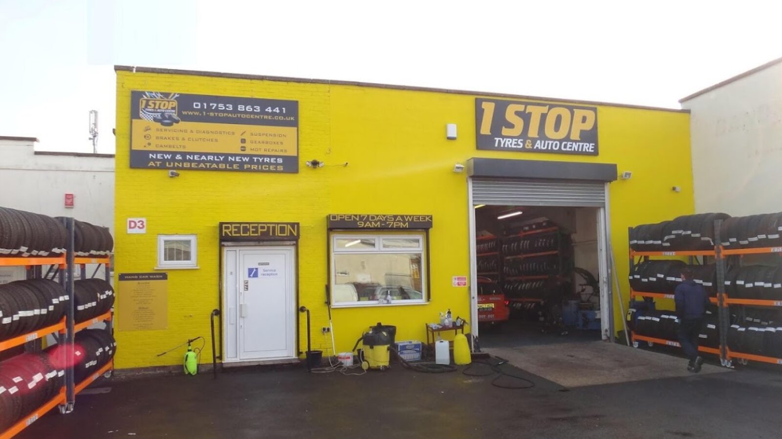
Premium Presentation - The layout employs a chequered racing flag pattern and a distinct yellow bordered emblem frame, giving the vector composition a highly recognisable, dynamic, and commercial signage presence.
Strategic Colour Choice - A vibrant automotive yellow is contrasted with deep tyre black and crisp white to evoke high visibility, occupational safety, and a trusted, fast paced workshop environment.
Target Audience Focus - The rugged, service oriented design is tailored to catch the eye of daily motorists, commercial fleet drivers, and local vehicle owners looking for rapid, dependable car servicing and tyre replacements.