Bespoke Cakes And Treats Stationery Design
This portfolio showcase highlights the corporate identity layout and print asset coordination for the Bespoke Cakes and Treats Business Stationery. The objective was to design a charming, highly organised, and elegant business stationary that bridges boutique confectionery artistry with professional corporate credibility, instantly communicating artisanal quality, premium ingredients, and structured business operations.
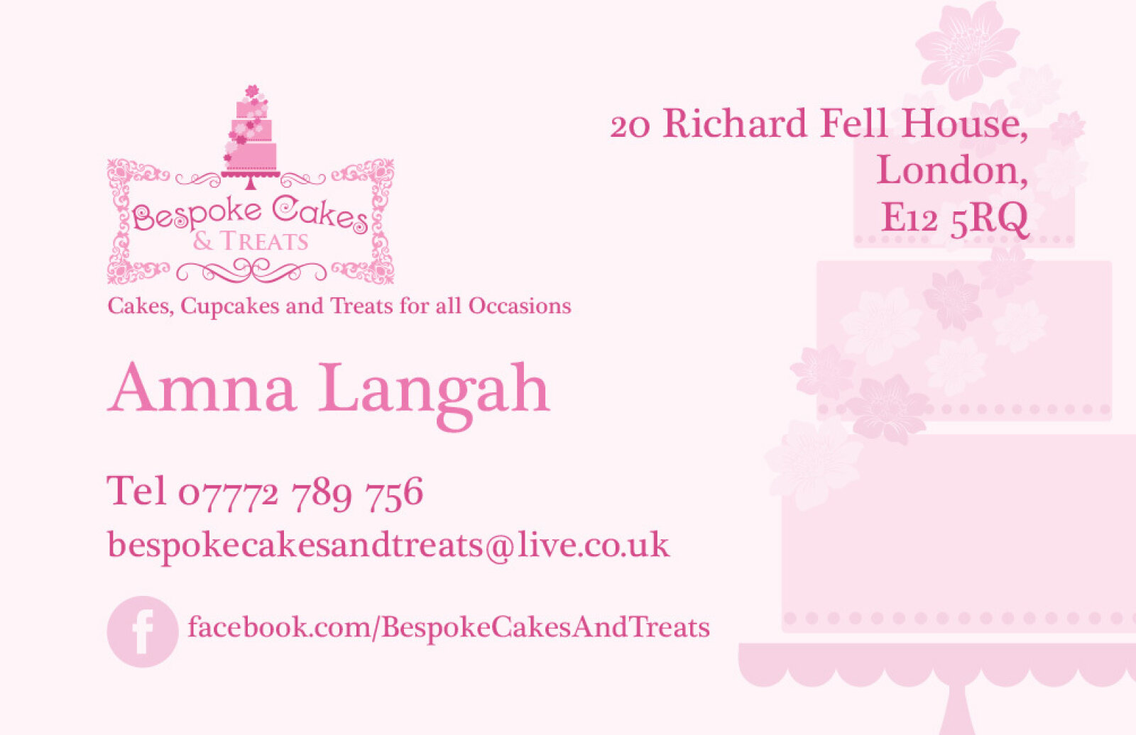
Design & Requirements Breakdown
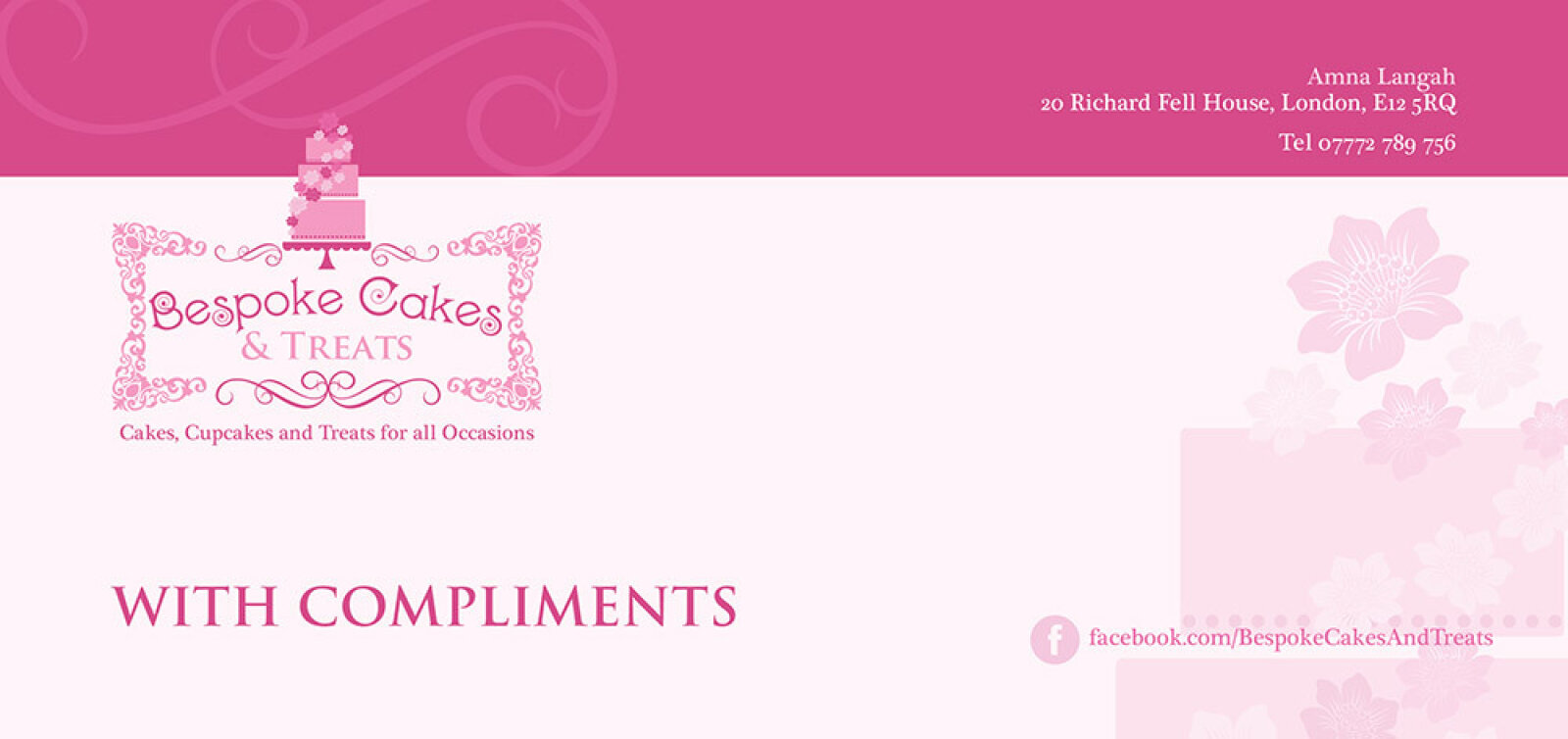
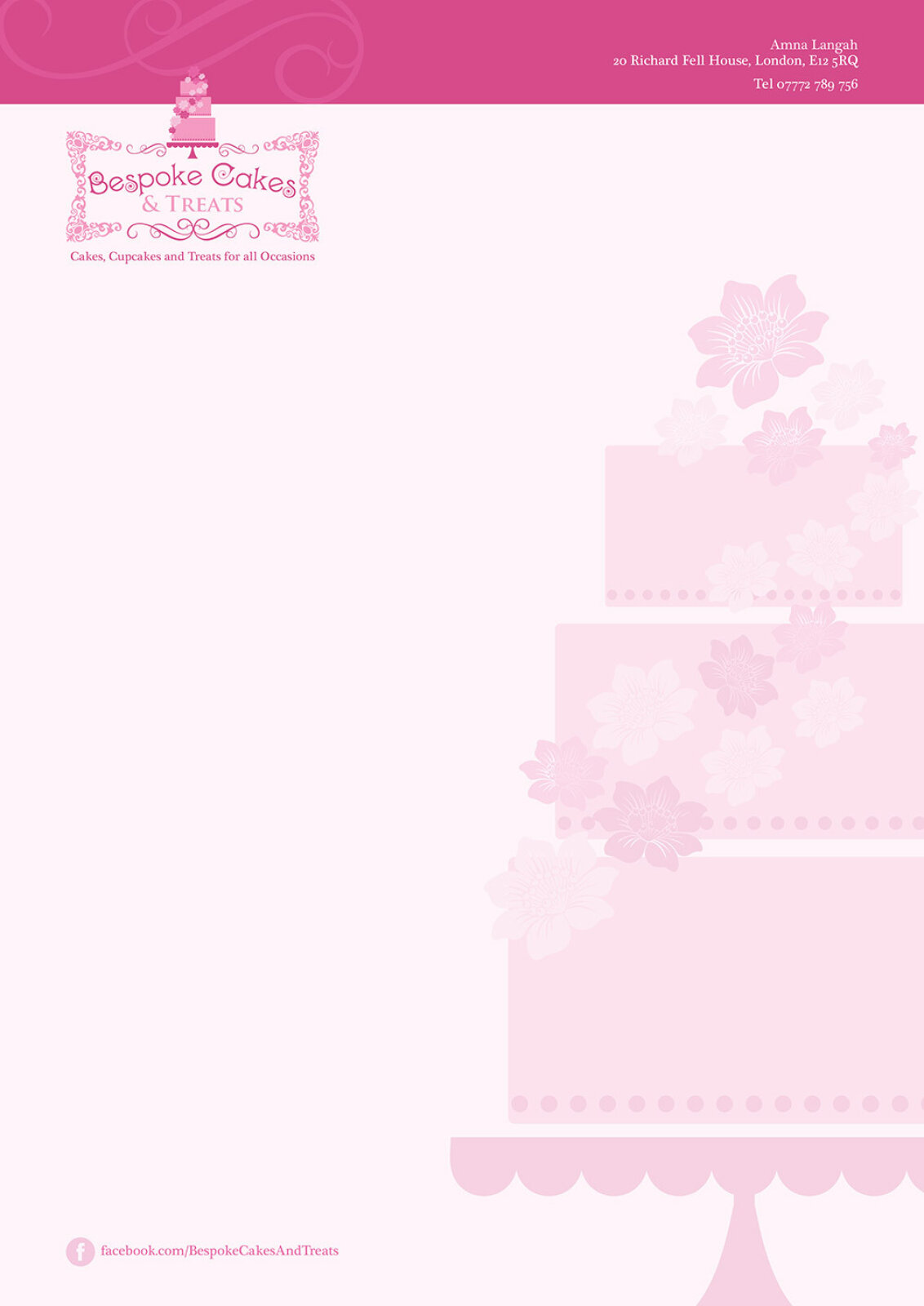
Visual Symbolism – The design features an intricate, ornate frame watermark motif that borders the primary brand logo across the letterhead and compliment slip canvas. A subtle, tone on tone damask texture motif sweeps across the vibrant headers, while a stylised, multi tiered cake illustration sits at the center of the logo badge, visually reinforcing professional pastry decoration, customised celebration designs, and exquisite culinary detail.
Typographic Architecture – An elegant, high contrast script logotype delivers the company name "Bespoke Cakes and Treats" with an inviting, artistic flair. On the corporate business card layout, this branding is perfectly balanced by a clean, lightweight sans-serif typeface that methodically organises individual contact coordinates, address records, and digital links, keeping a lightweight information hierarchy optimised for quick reading.
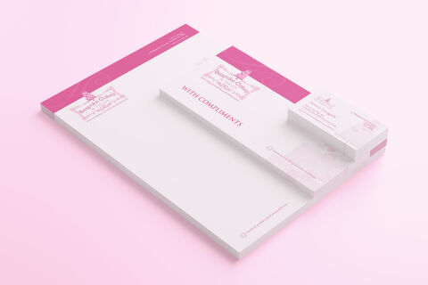
Premium Presentation – The stationery collection is showcased in a premium, 3D stacked print mock up composition resting on a soft, pastel tinted studio backdrop. This isometric perspective highlights a thick pad of official letterhead alongside a matching "WITH COMPLIMENTS" slip and a clean stack of business cards, demonstrating a polished stationary set optimised for catering consultations, event invoice billing, and luxury wholesale order management.
Strategic Colour Choice – A vibrant, appetising palette of rich magenta pink and delicate blush tones forms the core brand canvas and header blocks, heavily contrasted by a crisp white paper canvas and muted grey typography. This sweet, high contrast colour scheme evokes professional culinary passion, celebration joy, and an upscale, easily recognisable boutique brand identity.
Target Audience Focus – The elegant, detail first layout is tailored to engage private wedding clients mapping out custom cake reception services, corporate party planners organising premium event catering, and local bakery patrons seeking high end, artisan grade celebratory confections.