Hardcore Supplements – Retail Brand Identity

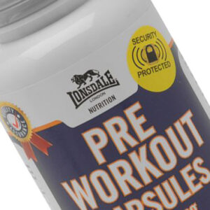
The Beast Inside Hardcore Supplements concept

The Saint Nicolas creatives were tasked in 2015 of developing a fierce retail brand identity for a new range of sports supplements called ‘Hardcore Supplements’. Aimed at the serious end-user in body muscle building and definition, the conceptual design around the packaging was to create a visual feeling of strength and power. The use of the dark colour pallet with neon highlights in yellow for the standard range and hot pink for the female aimed range of products gives Hardcore it’s memorable bold identity without dating the brand around an already saturated market place, where standing out on the shelf is key.

12 different packaging ranges were created in both unisex and female-aimed ranges alongside the marketing and promotional creatives to promote the new retail brand identity to the marketplace.

Hardcore Supplements is all about it’s core values, boldness, superior strength and maintaing it’s fun & enjoyable appeal.